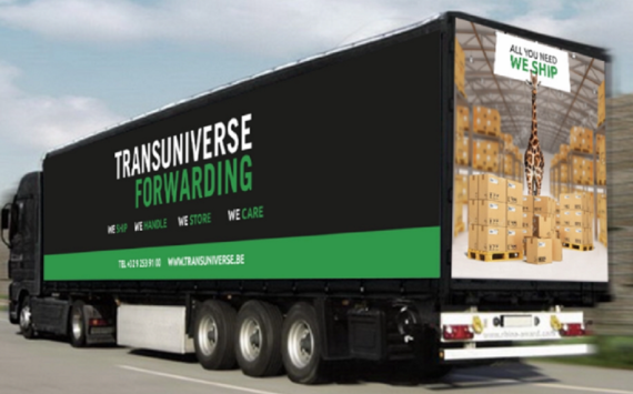
A new structure demands a new house style. This puts a modern, consistent and immediately recognisable face on everything to do with Transuniverse Group, from the trucks to the website and business cards.
The new house style is part of Transuniverse’s efforts to profile itself more actively in the market as a company that is not to be overlooked.
“It makes us more visible and promotes the message that we know who we are and where we are heading”, operations manager Kevin Van Ongeval emphasises. “We are really going for it. This year’s figures are great, for a start.”
The key colours will still be black, green and white, but the design is sleeker and it will be used more consistently for all our materials. These colours determine the general appearance of the website.
They are used on our business cards for the slogan ‘We ship, we handle, we store, we care’.
Soon they will also be featured on sixty trailers belonging to our subcontractors. Thirty vehicles used nationally will be adapted first. In the second phase, we will adapt the same number of trailers used for international routes. This will give Transuniverse Group even more visibility.